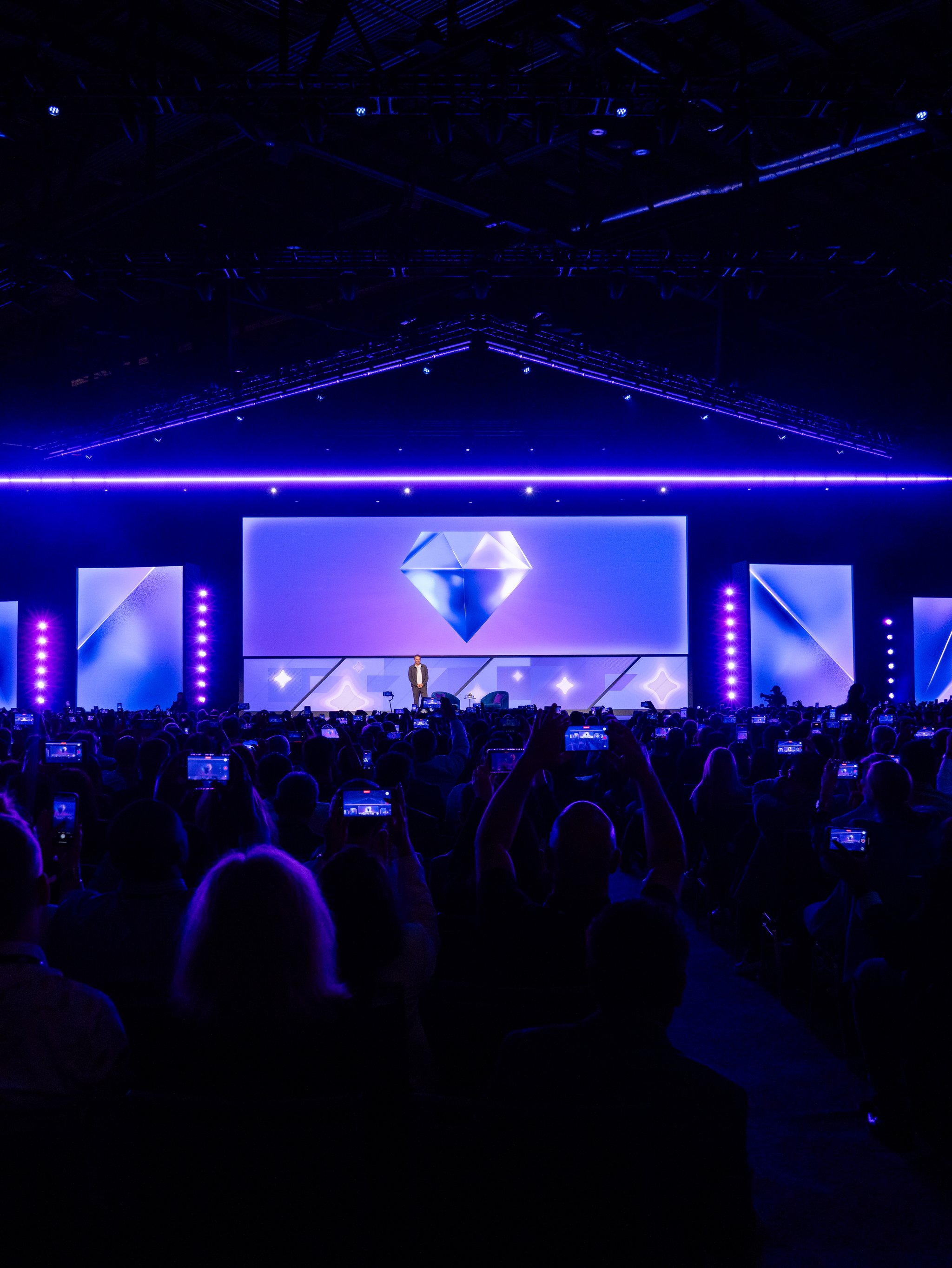
Made by Google 2024
Made by Google 2024
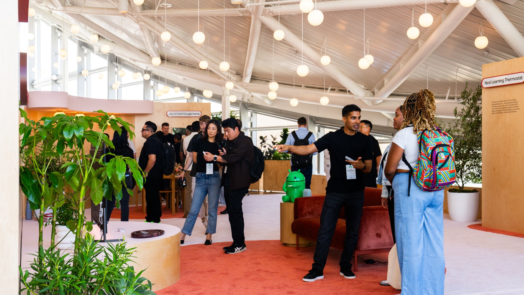
Hardware and AI Launch4684 For Google's 2024 hardware and AI launch at Bay View, we designed and built a hands-on Sandbox that turned abstract AI features into inhabitable product worlds — giving press and product teams the space to find each other naturally.
Scope
- Design
- Audio / Visual Production
- Custom Fabrication
- Operation / Support
- Creative Direction
- Generative Content
- Spatial Design
- Creative Technology
- Visual Content Design
- Project Management
There's a version of a product launch that feels like a trade show. Screens on stands. Features explained. A room you walk through and leave having been informed. Made By Google 2024 was not that.
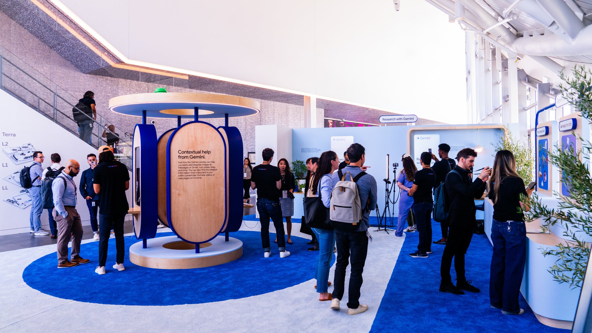
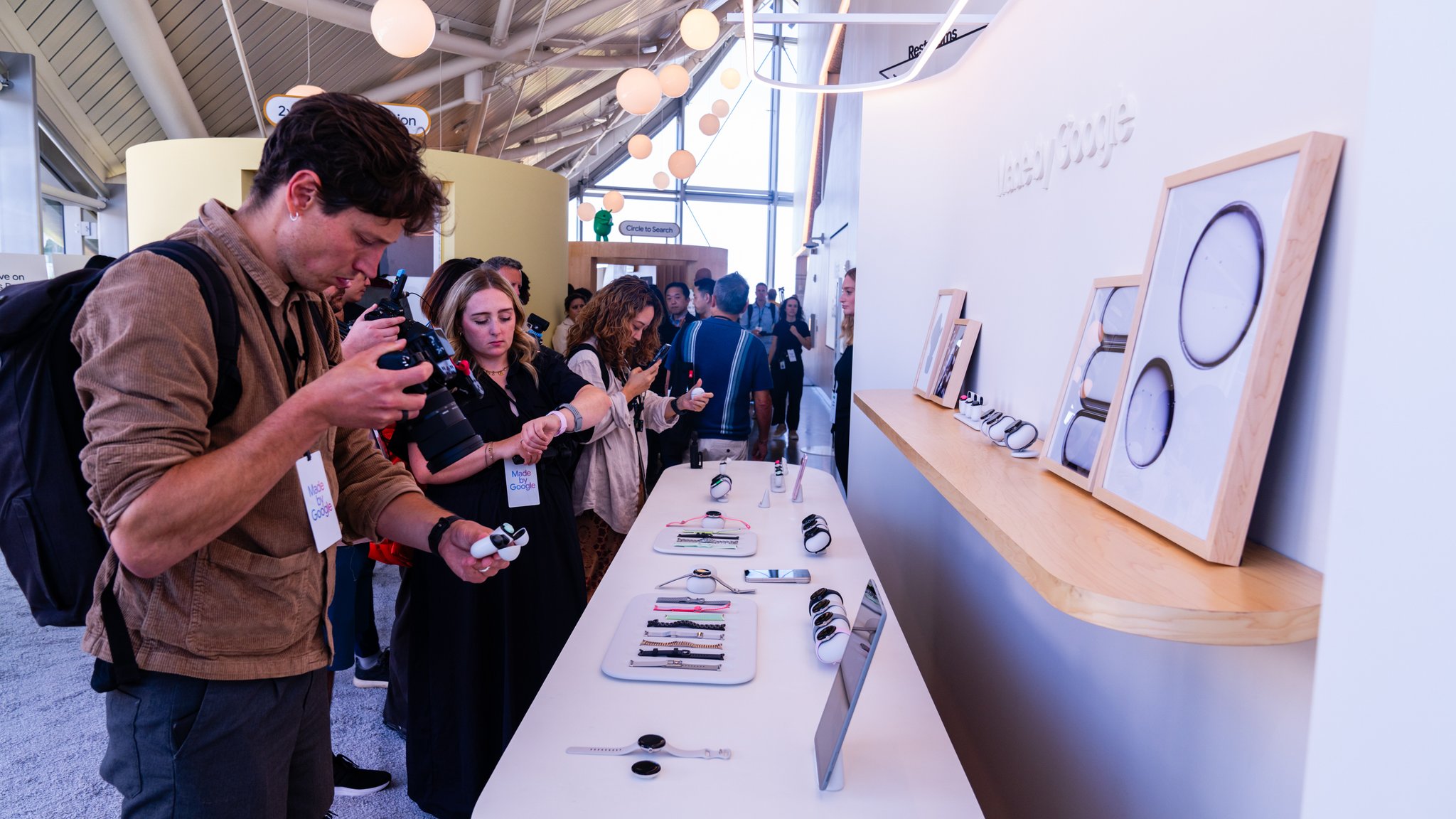
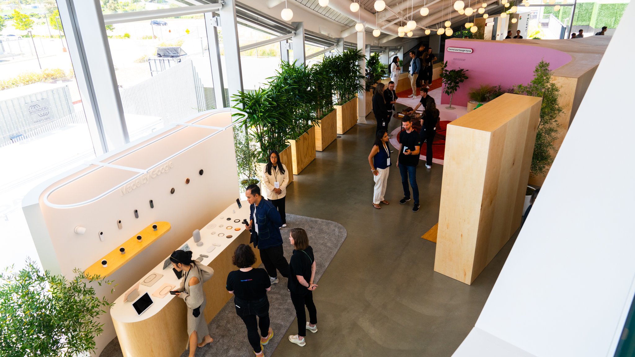
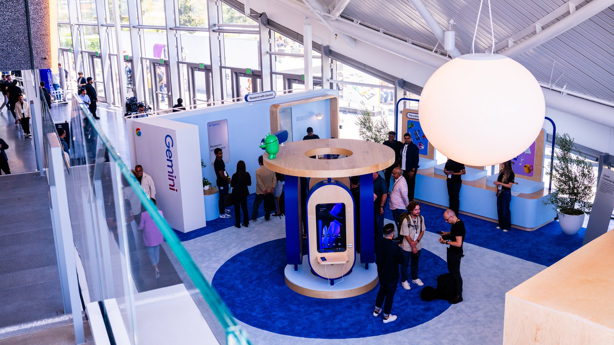
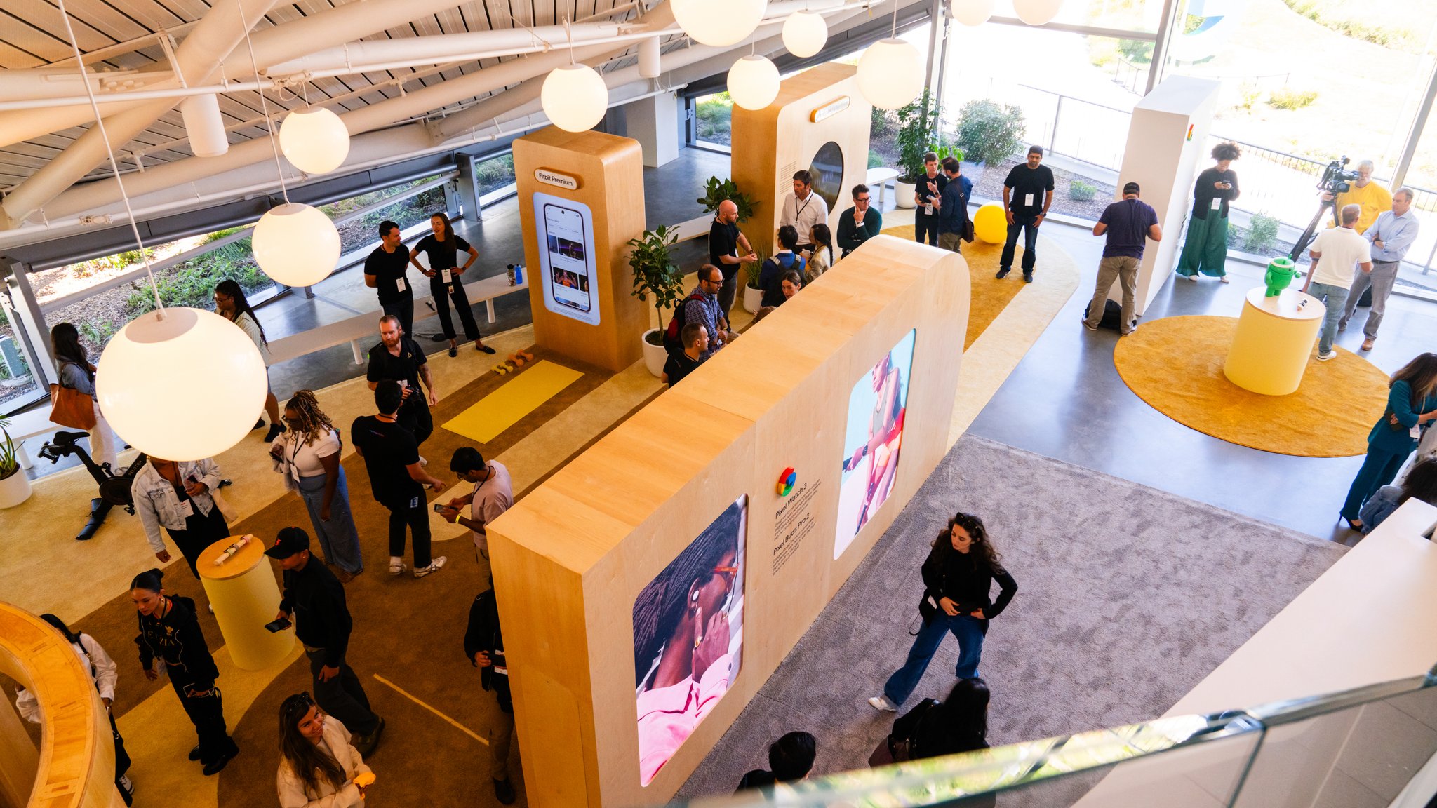
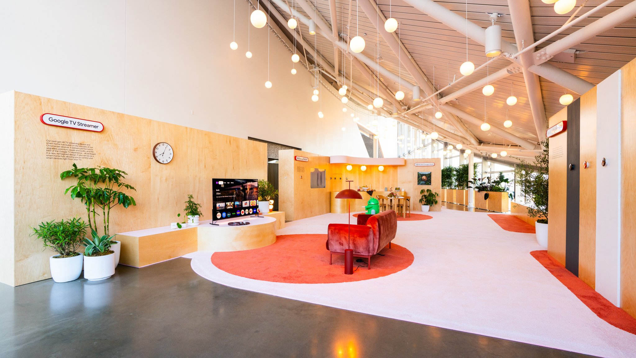
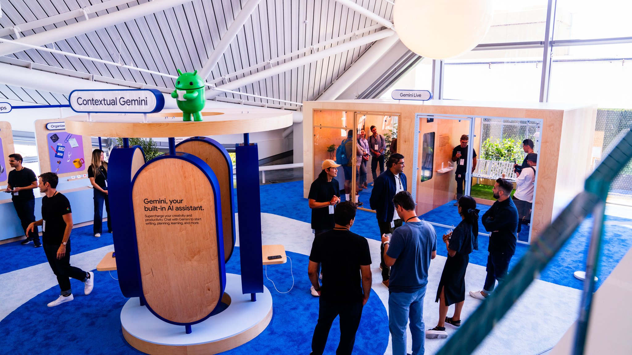
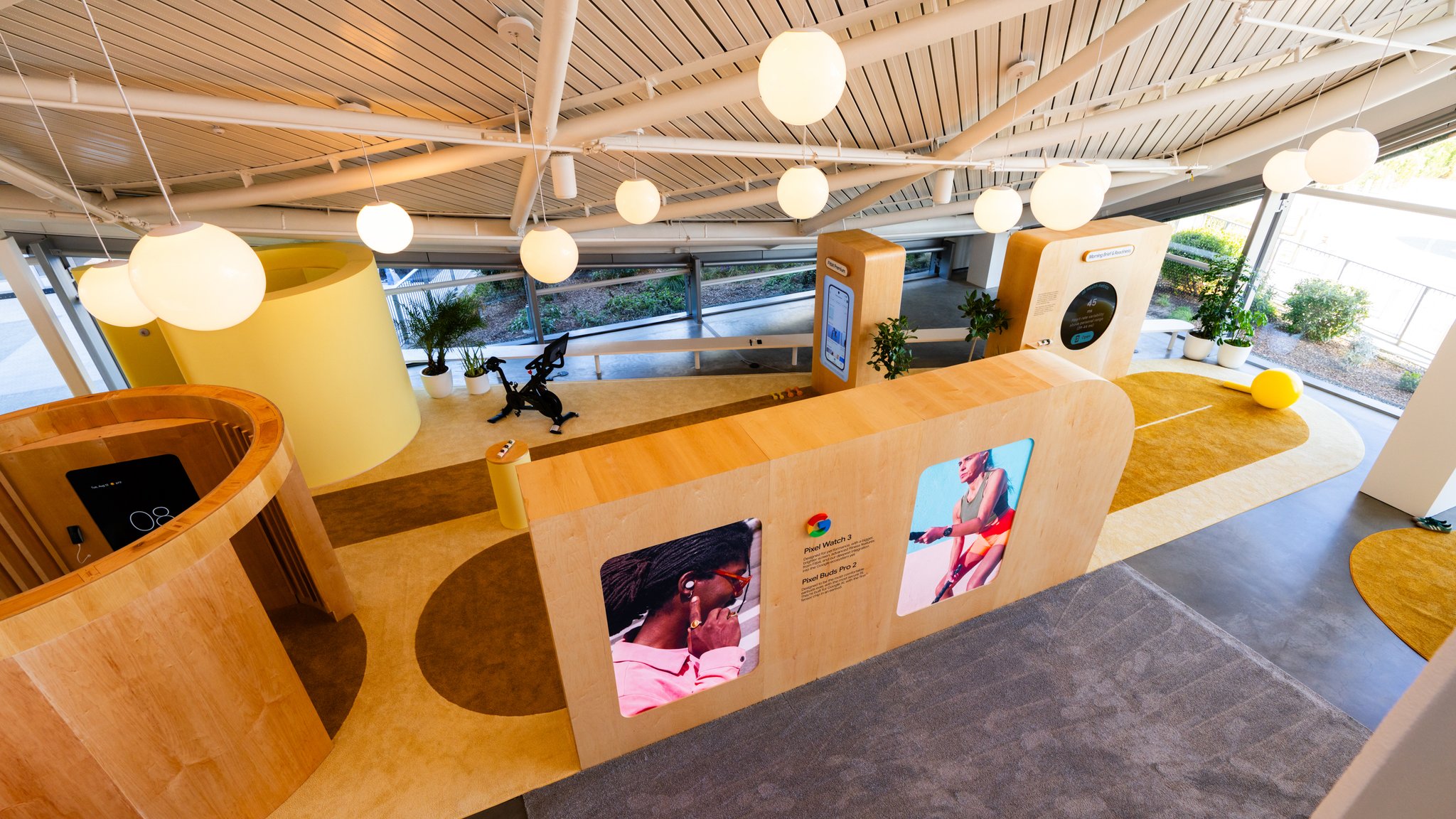
For the Sandbox at Google Bay View — the hands-on environment where press and tech influencers got to meet Google's 2024 hardware and AI lineup — we designed and built something closer to a series of inhabited worlds. Four zones, each anchored to a product family: Gemini, Pixel, Wearables and Health, Home. And within each, a set of vignettes that didn't demonstrate features so much as give them a place to live.
For the Sandbox at Google Bay View — the hands-on environment where press and tech influencers got to meet Google's 2024 hardware and AI lineup — we designed and built something closer to a series of inhabited worlds. Four zones, each anchored to a product family: Gemini, Pixel, Wearables and Health, Home. And within each, a set of vignettes that didn't demonstrate features so much as give them a place to live.
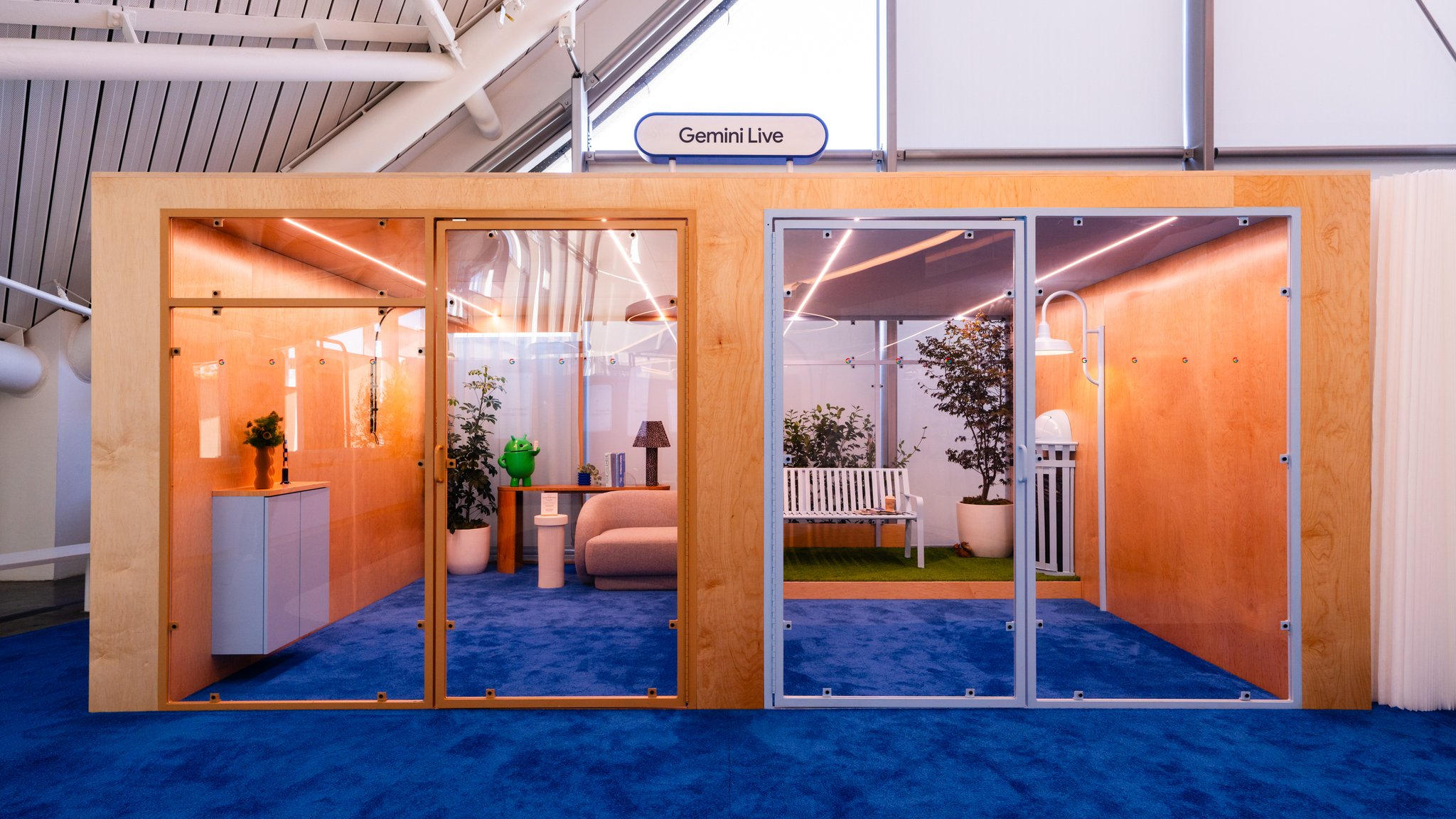
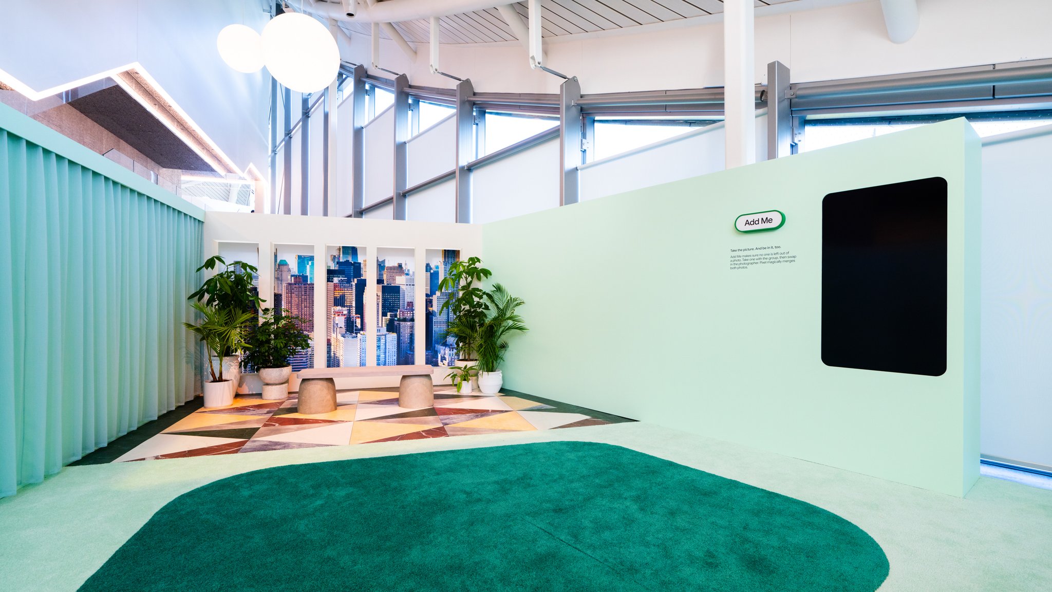
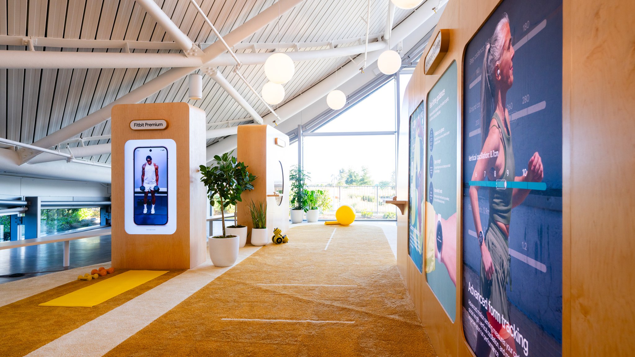
This was a Gemini-heavy launch. Roughly seventy percent of what Google was introducing was AI — features that don't have a physical form, that only reveal themselves when someone uses them. The design challenge was real: how do you make software feel worth touching? How do you show the relationship between features without lining up a row of phones pointing at the ceiling?
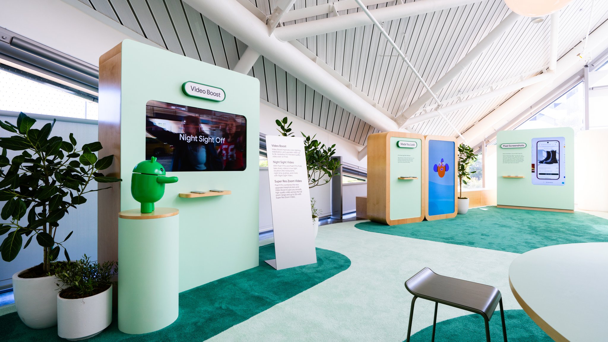
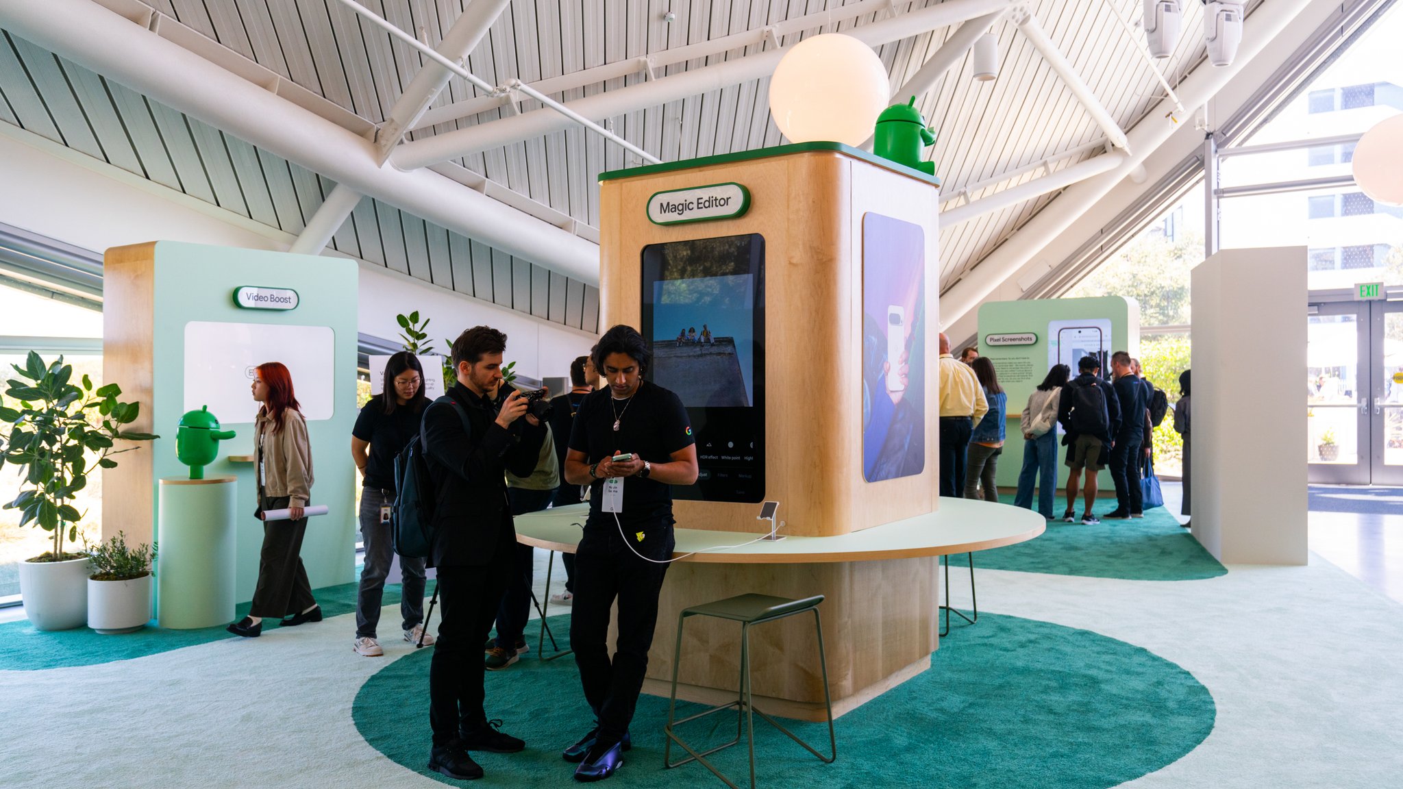
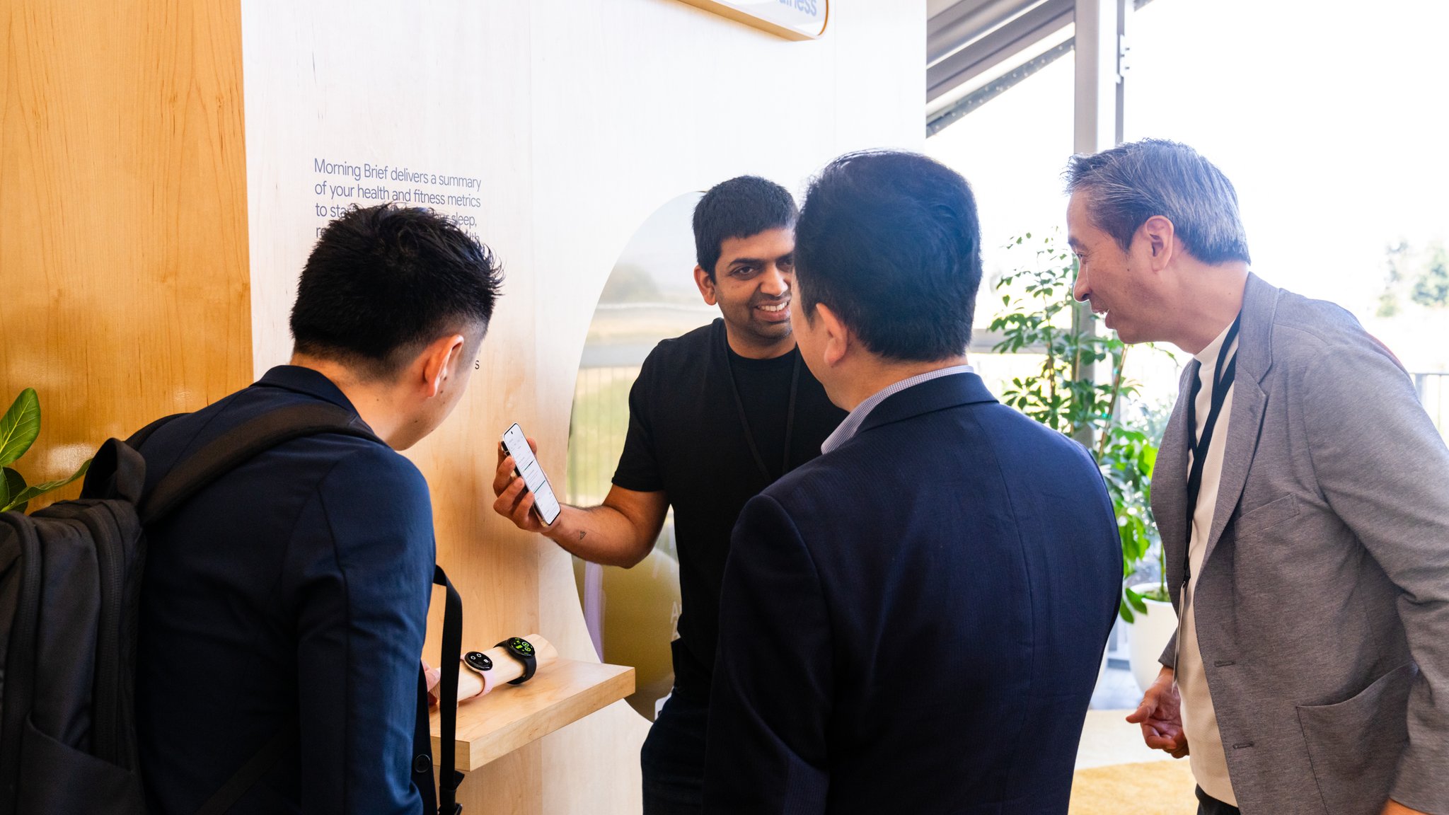
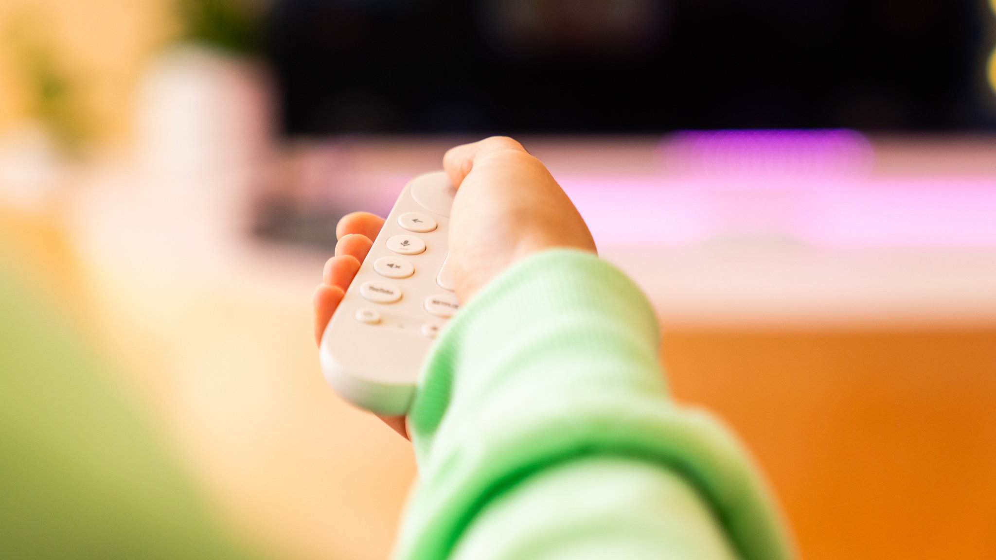
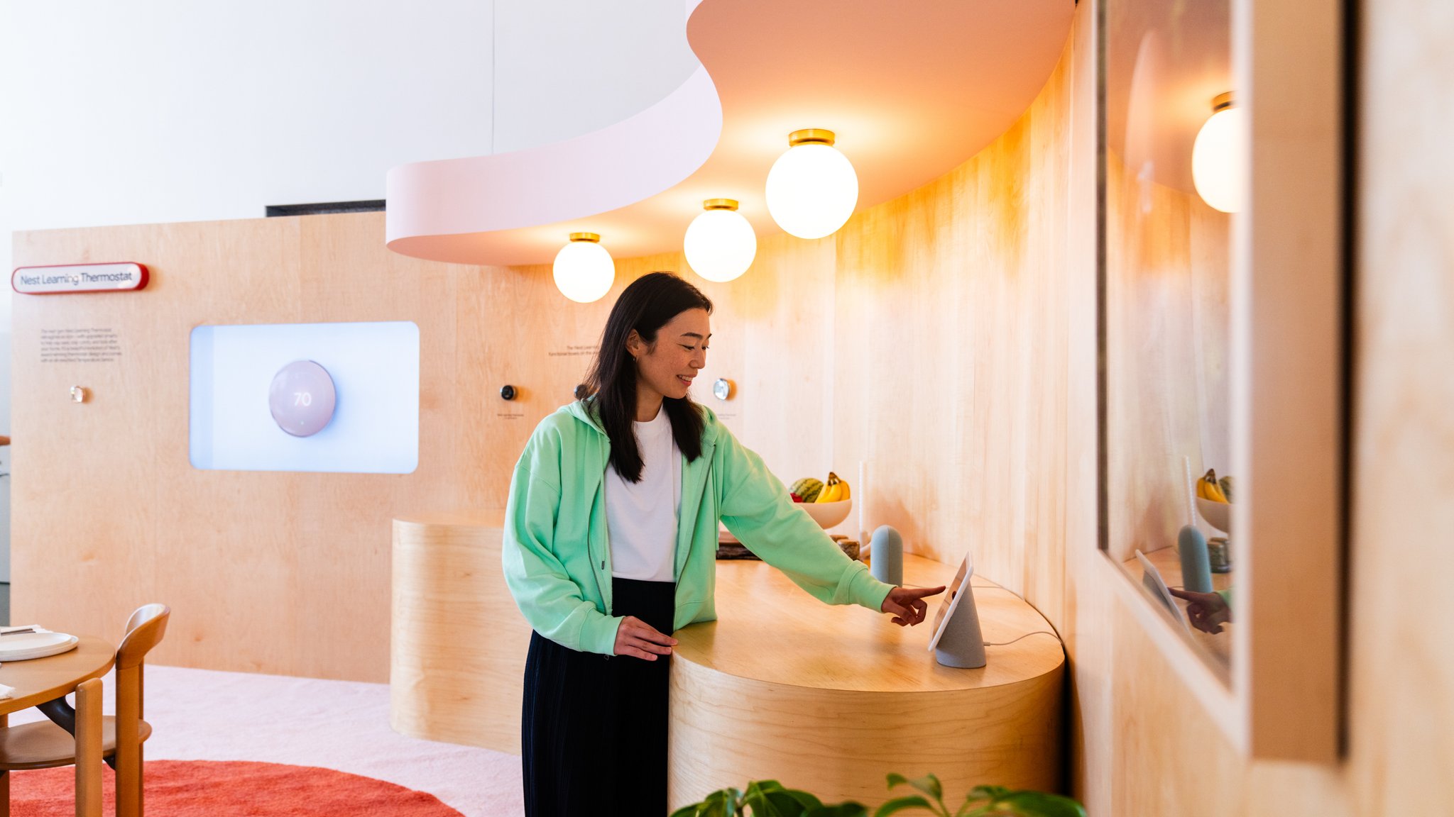
Our answer was spatial and contextual. Each vignette was built around a scenario — a moment of actual use — rather than a spec. The Pixel zone put photo and video features inside the conditions where you'd reach for them. The Health and Wearables zone organized around the rhythms of a day. The Home zone placed Gemini-powered features inside the domestic contexts where they make sense. The result was a Sandbox where the product teams and the press found each other naturally, in spaces that opened up conversation rather than scripting it.
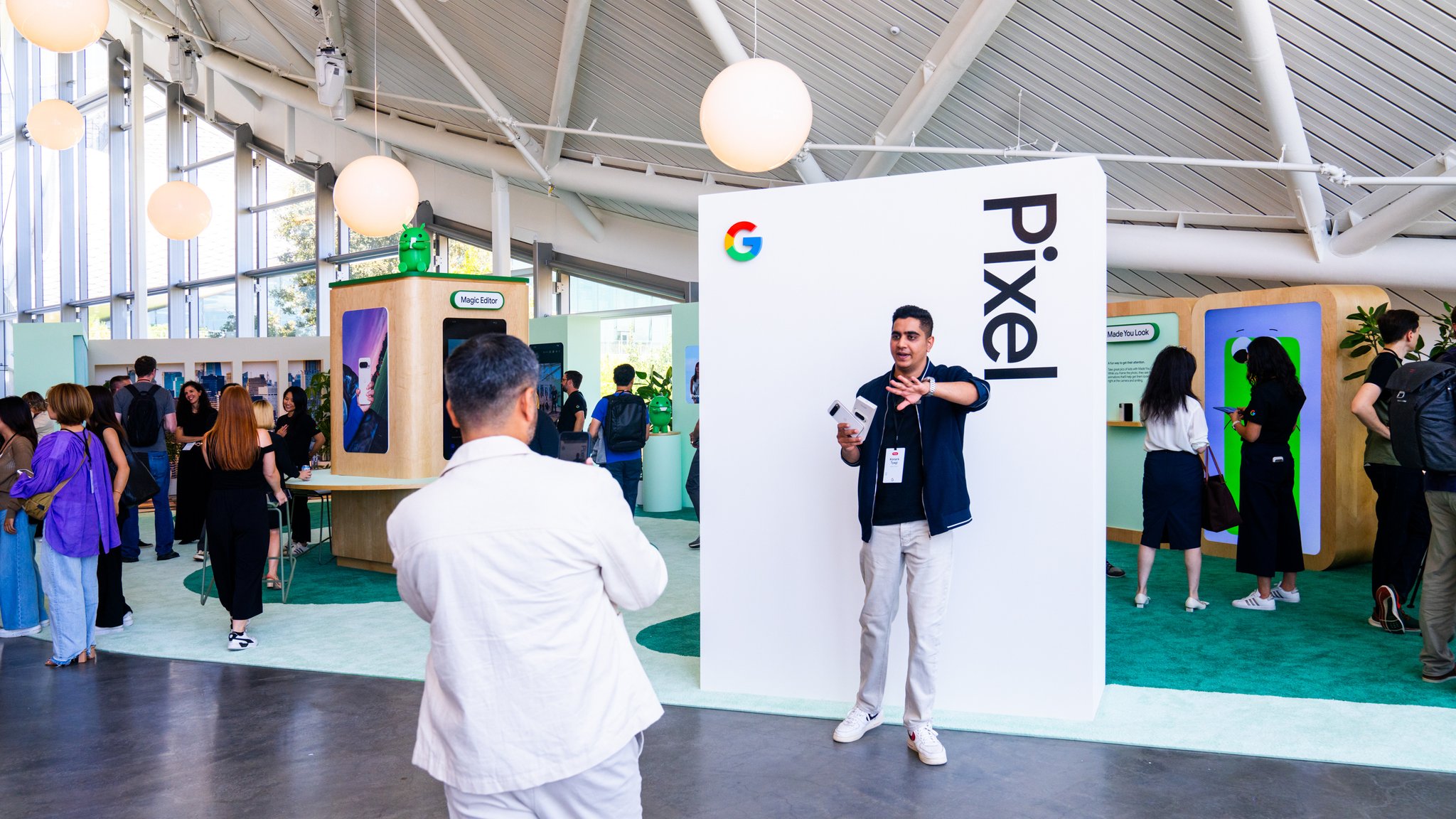
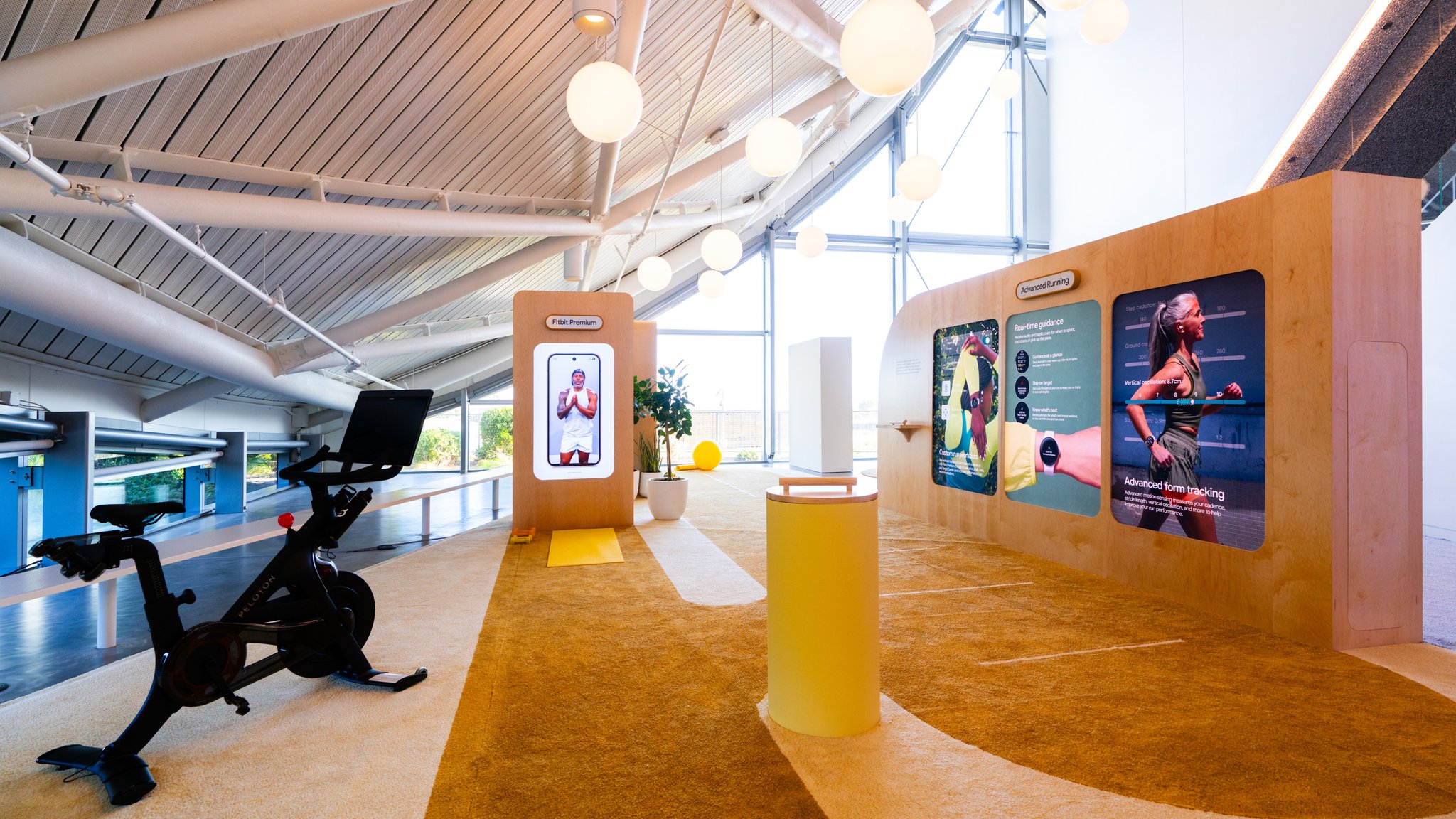
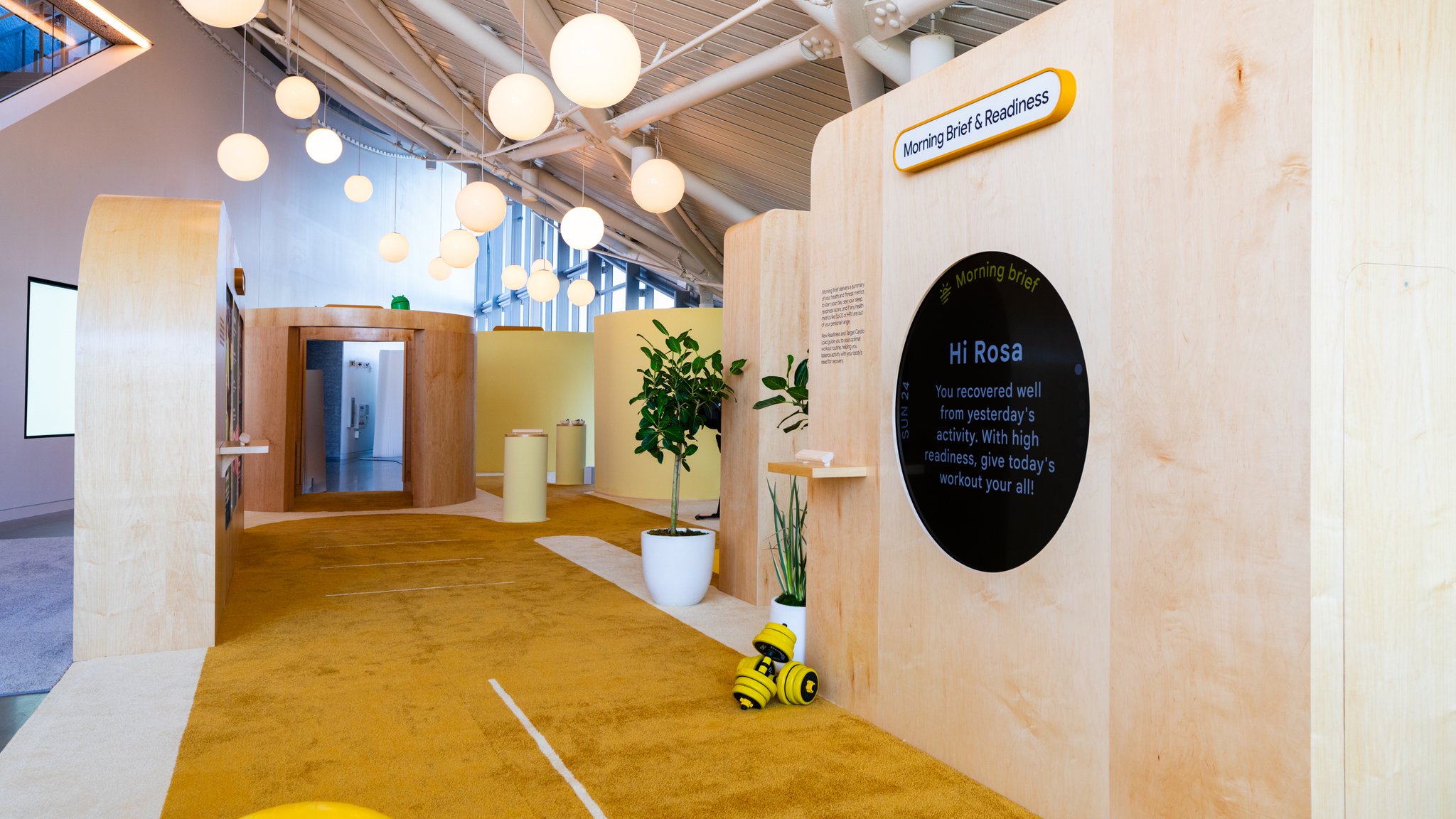
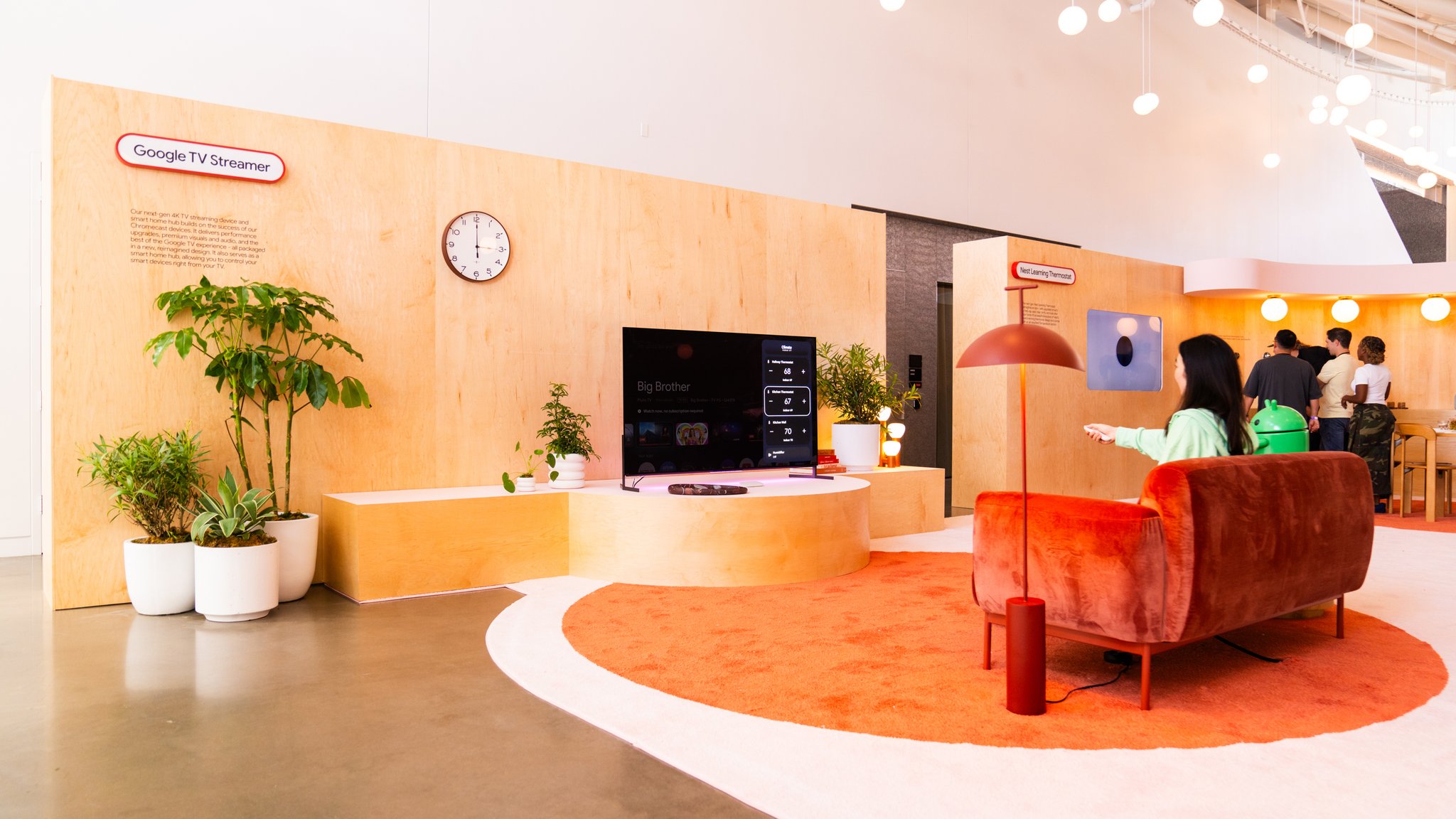
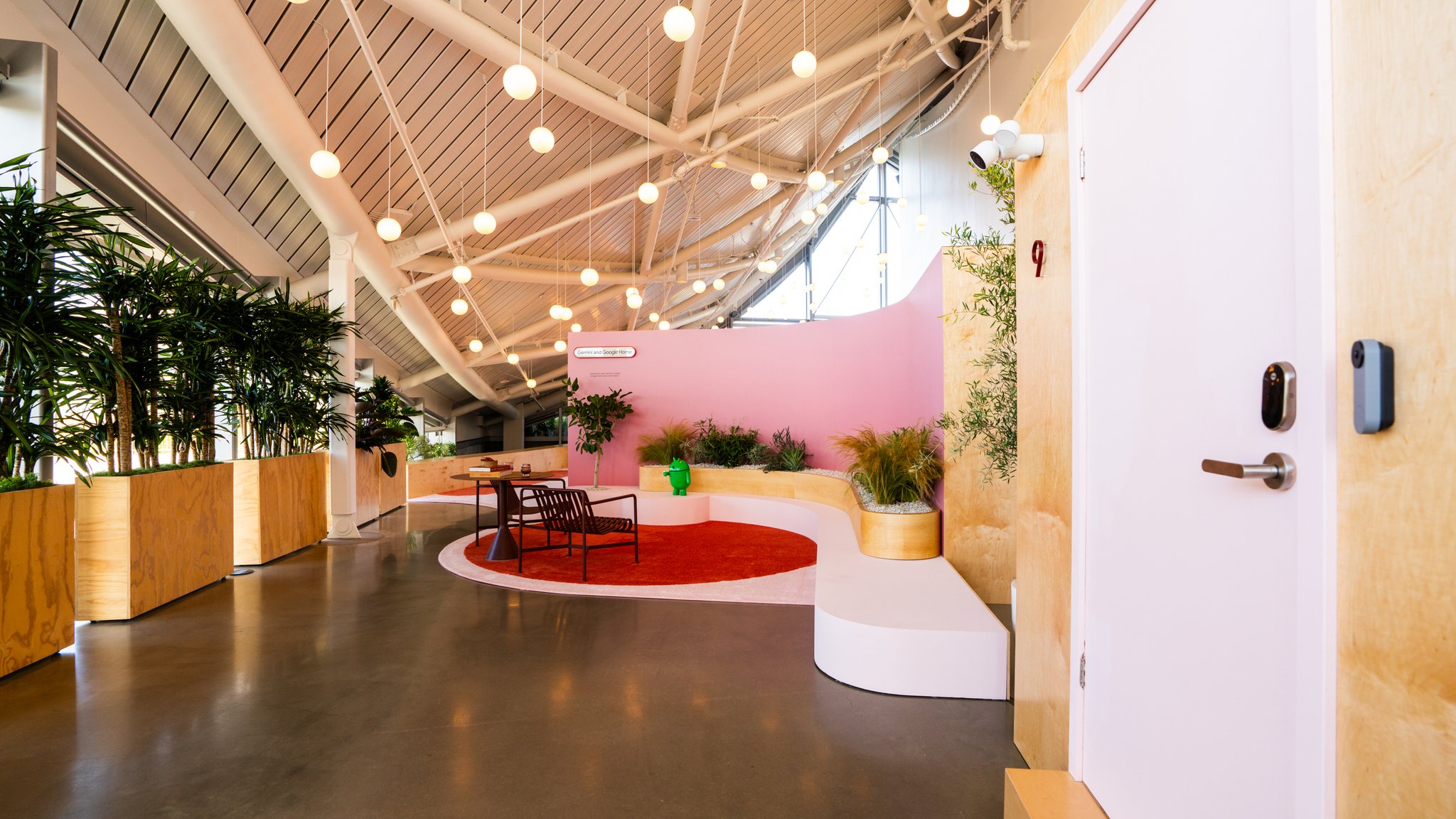
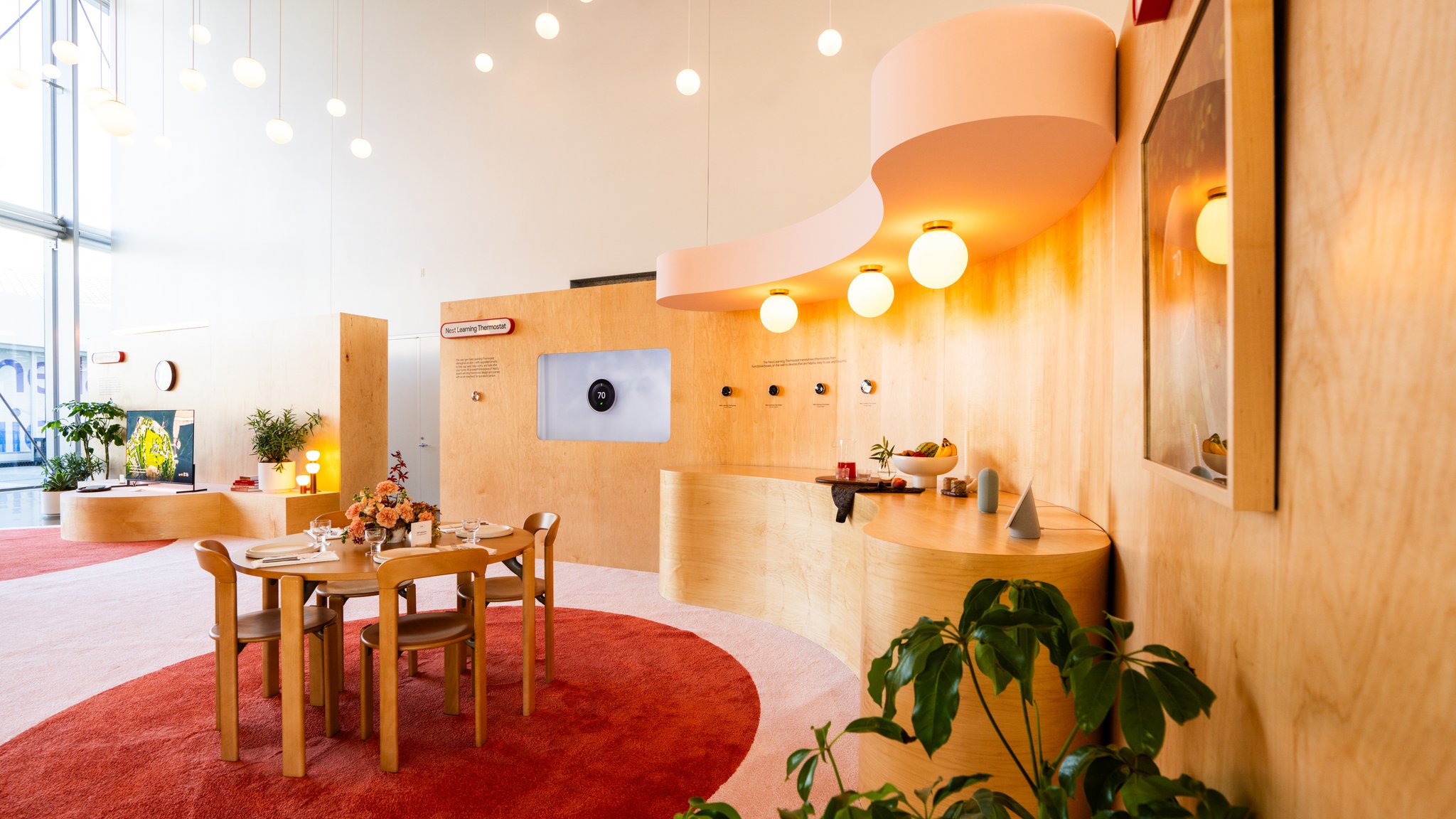
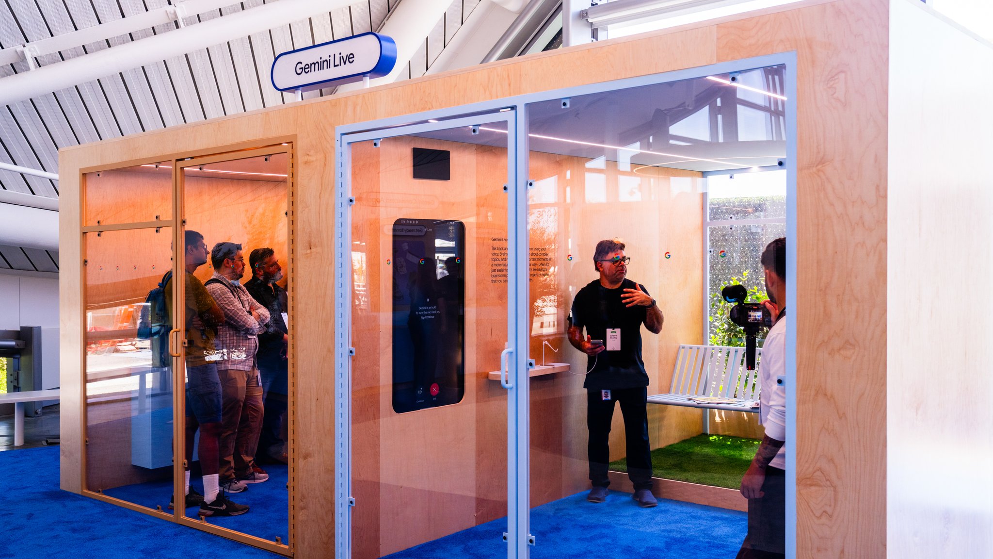
That's a specific skill: knowing how to personify technology. Not illustrate it — personify it. Give it posture, context, a reason to exist in a room. We've done enough work with Google over the years to understand how their design language thinks — the material warmth they reach for, the way color does structural work in their spaces, the balance between precision and approachability. That fluency meant we weren't interpreting a brief cold. We were building in a language we already spoke.
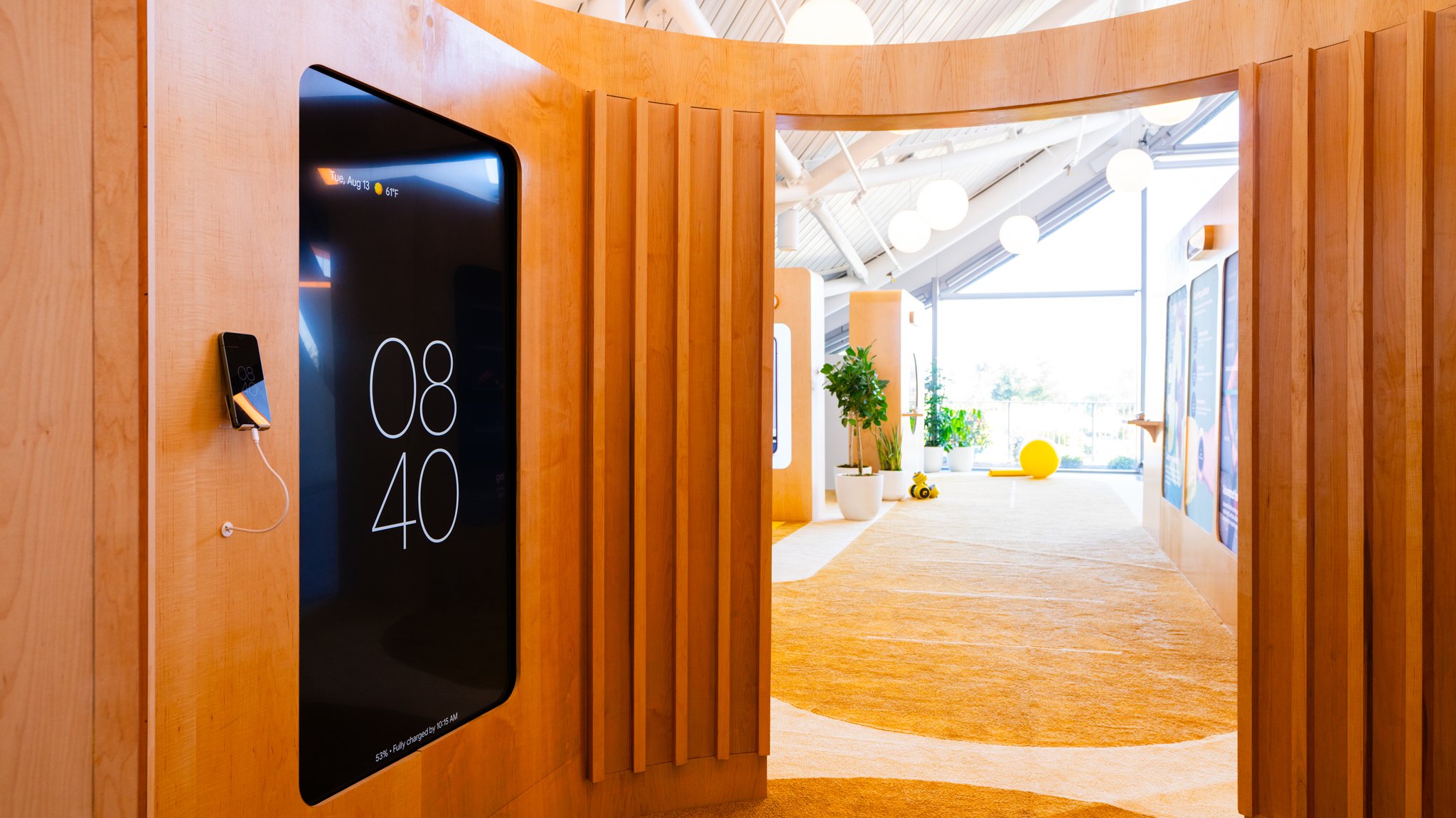
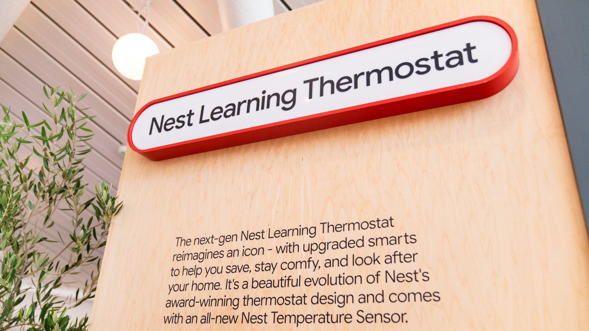
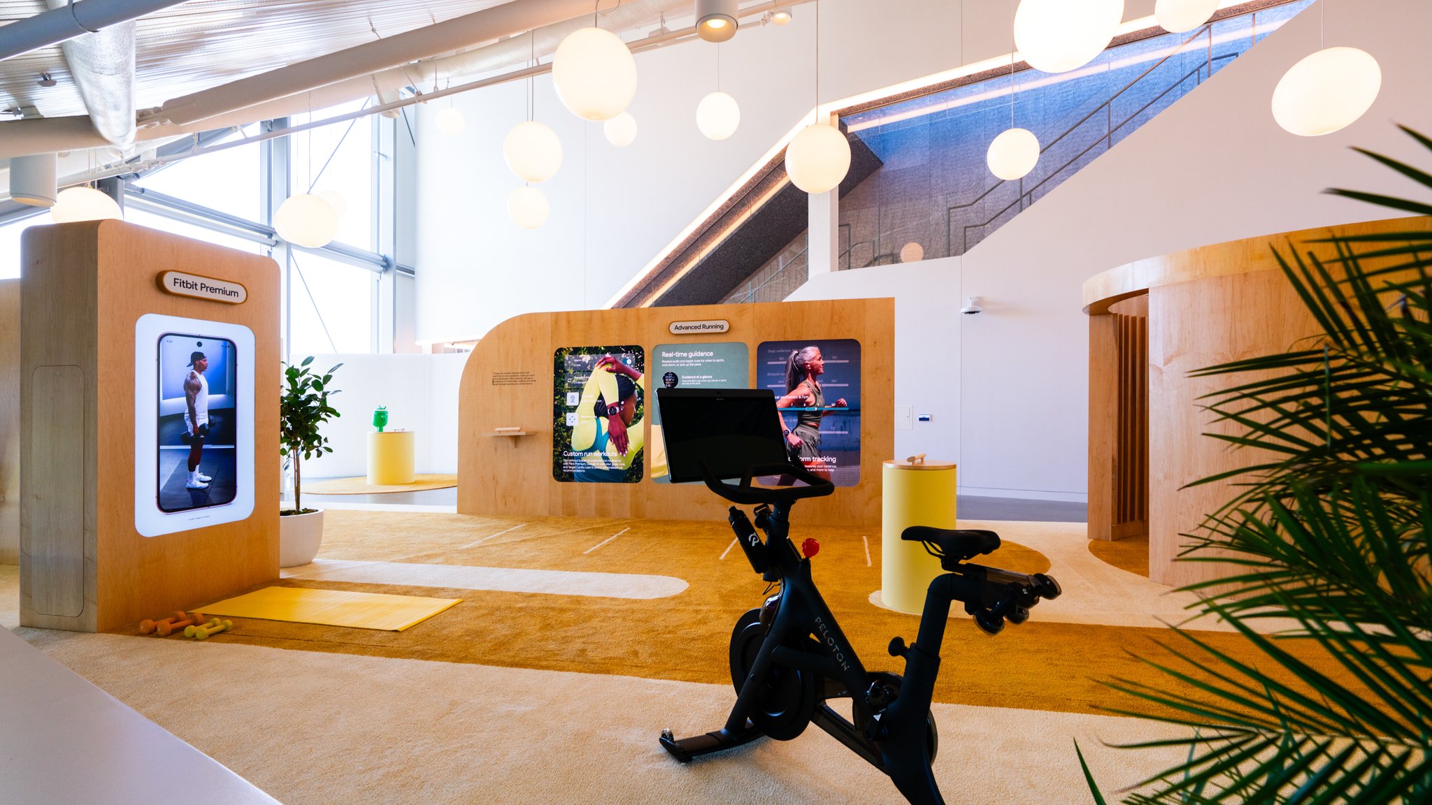
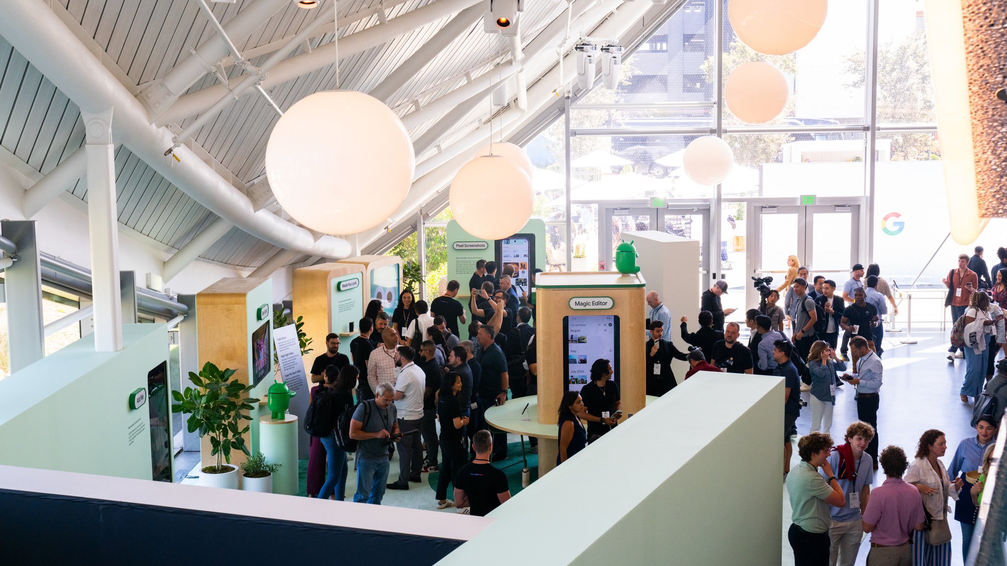
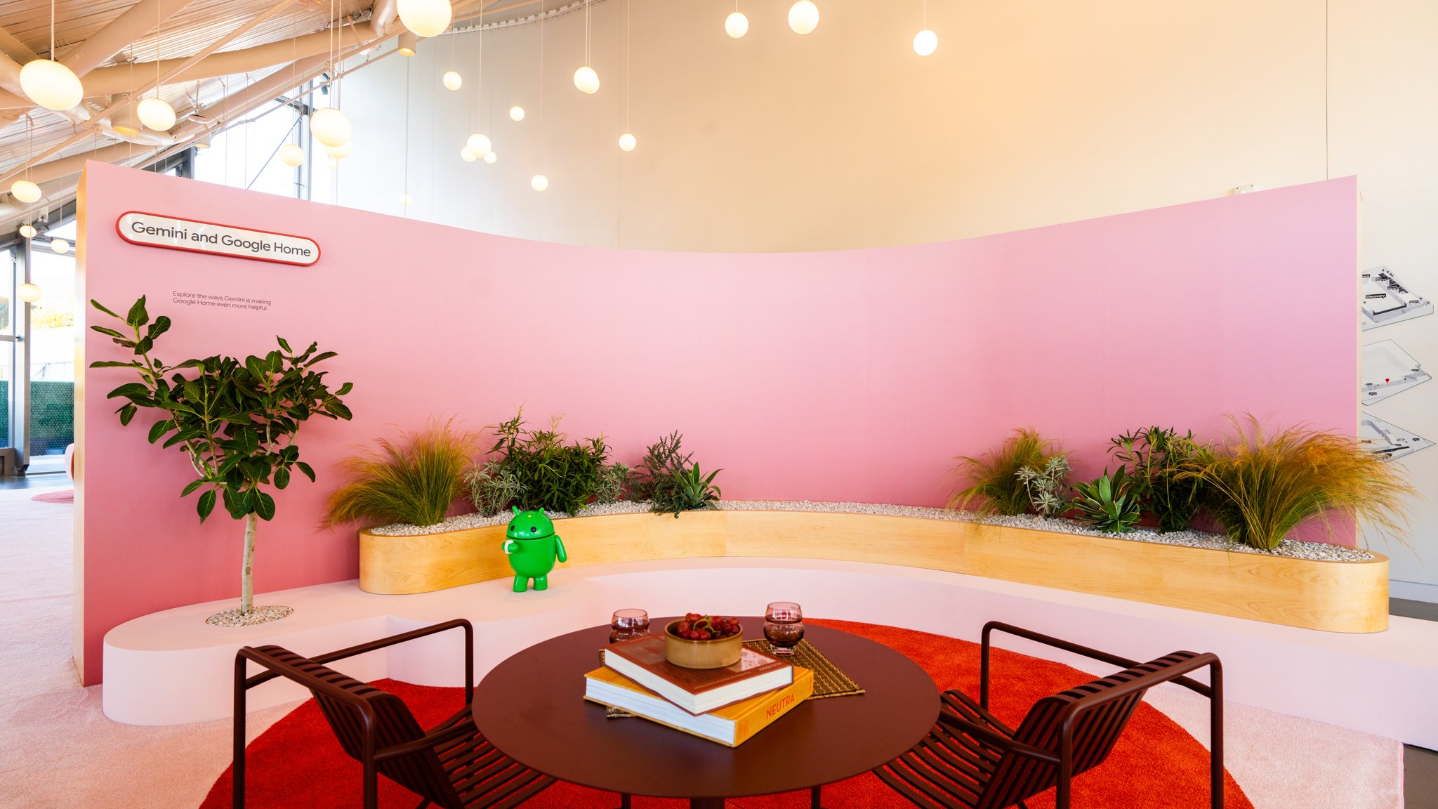
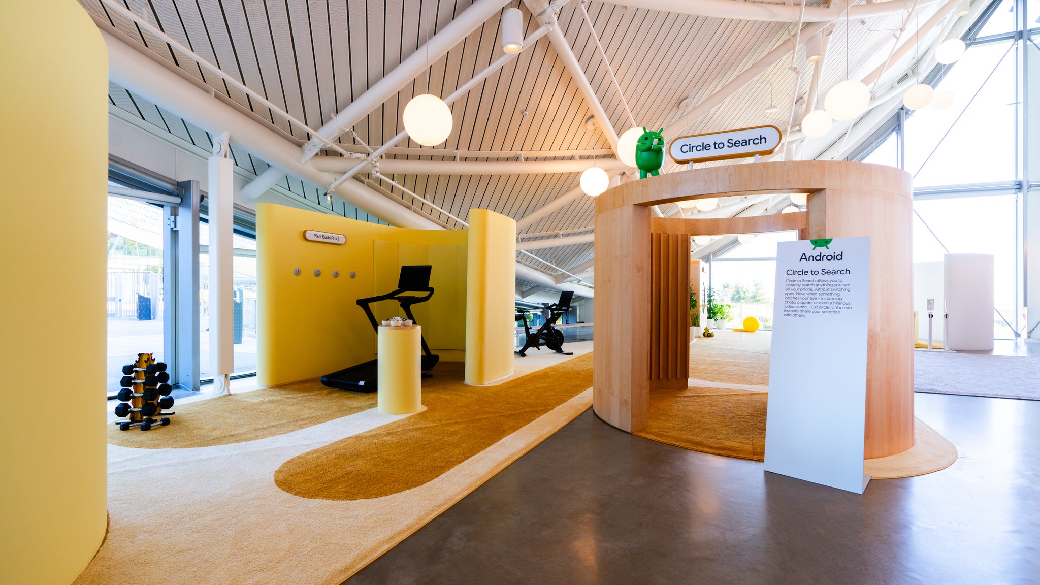
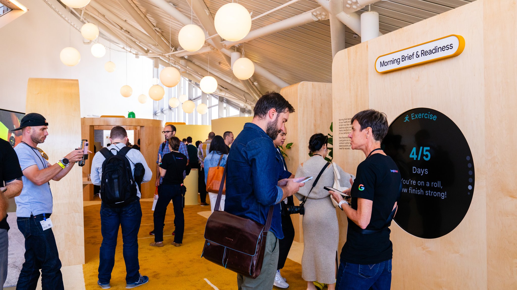
The material palette held the four zones together while letting each breathe on its own: maple wood, dark carpet, pastel tints on demo structures, clean pops of Google's core brand colors. Area beacons and zone signage handled wayfinding without announcing it. The CT integrations — audio environments, multi-device screen mirroring, custom web UI controls, BrightSign-driven content — were built in close collaboration with Google's own product teams, each one tuned to serve the demo rather than showcase the technology behind it.
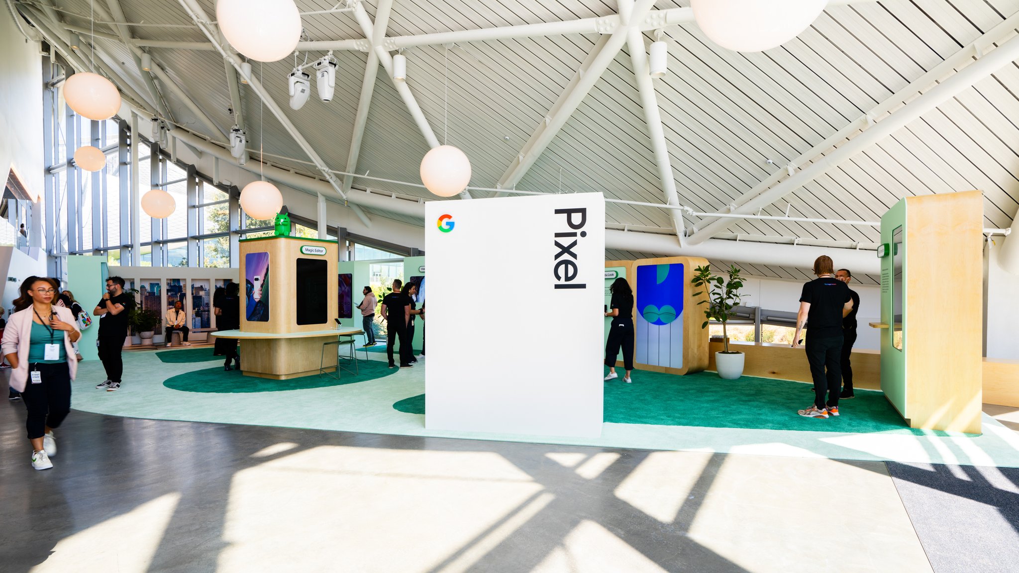
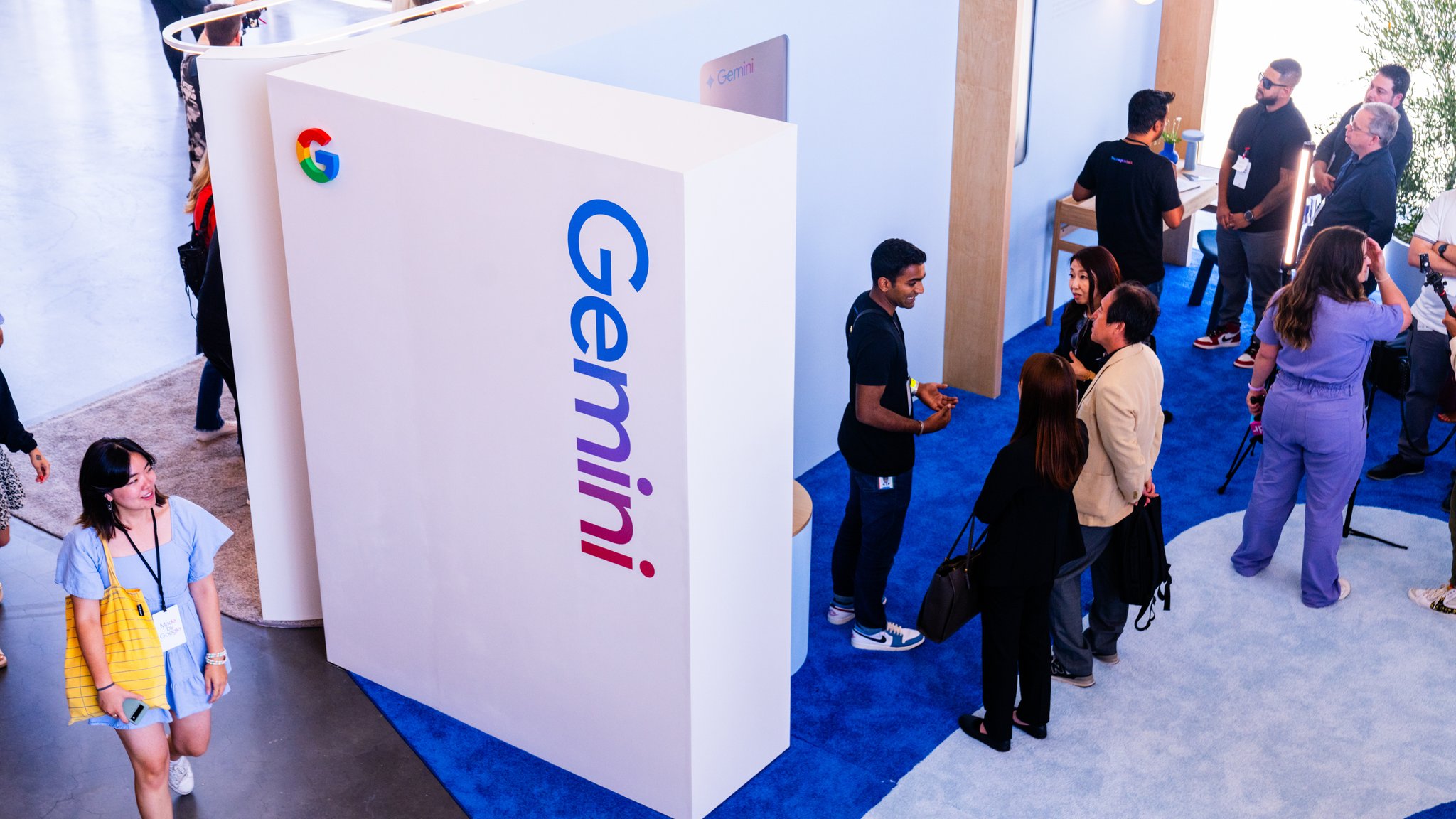
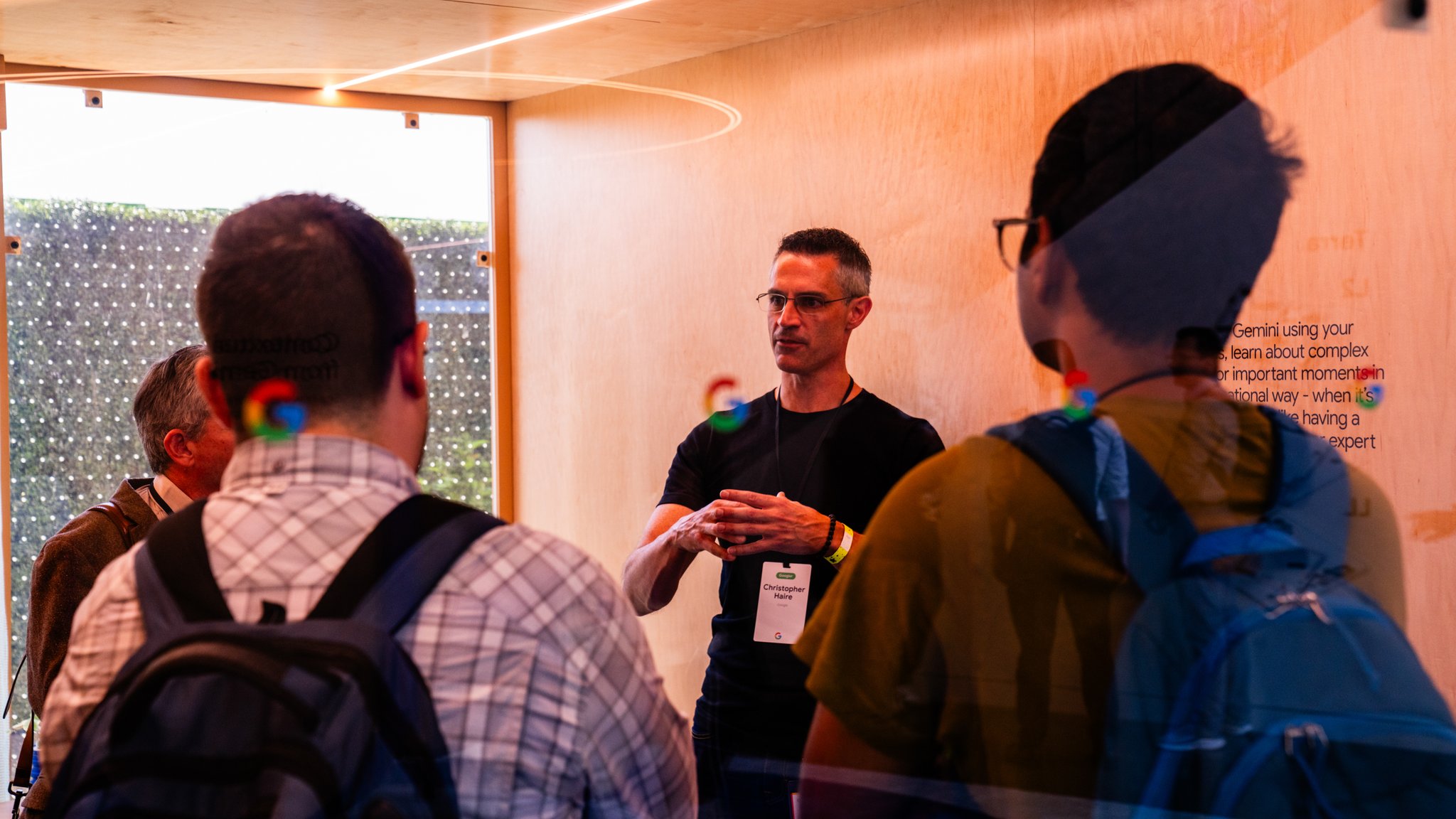
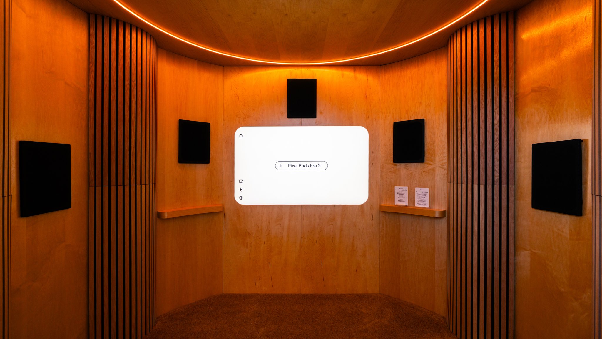
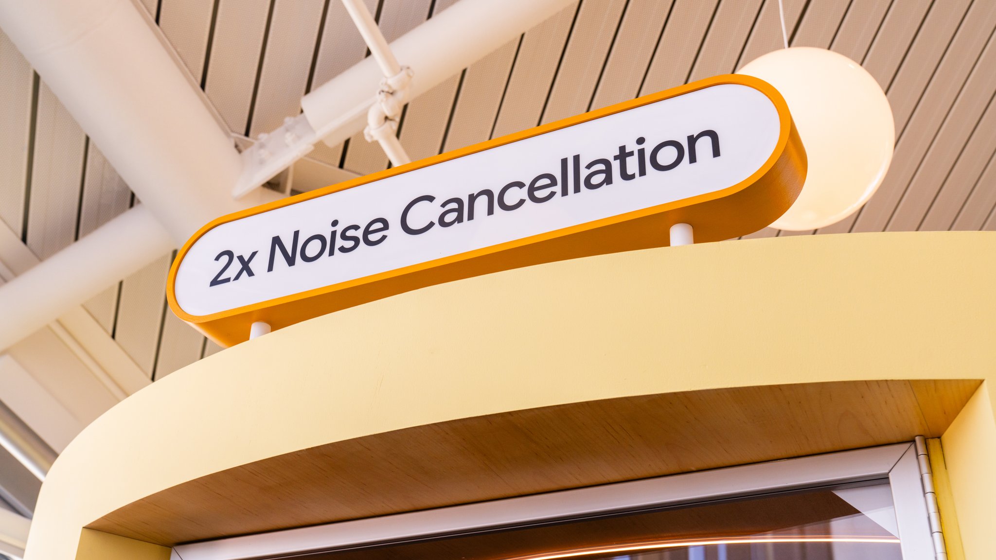
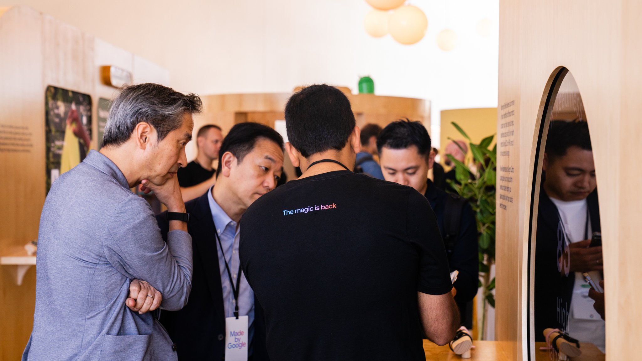
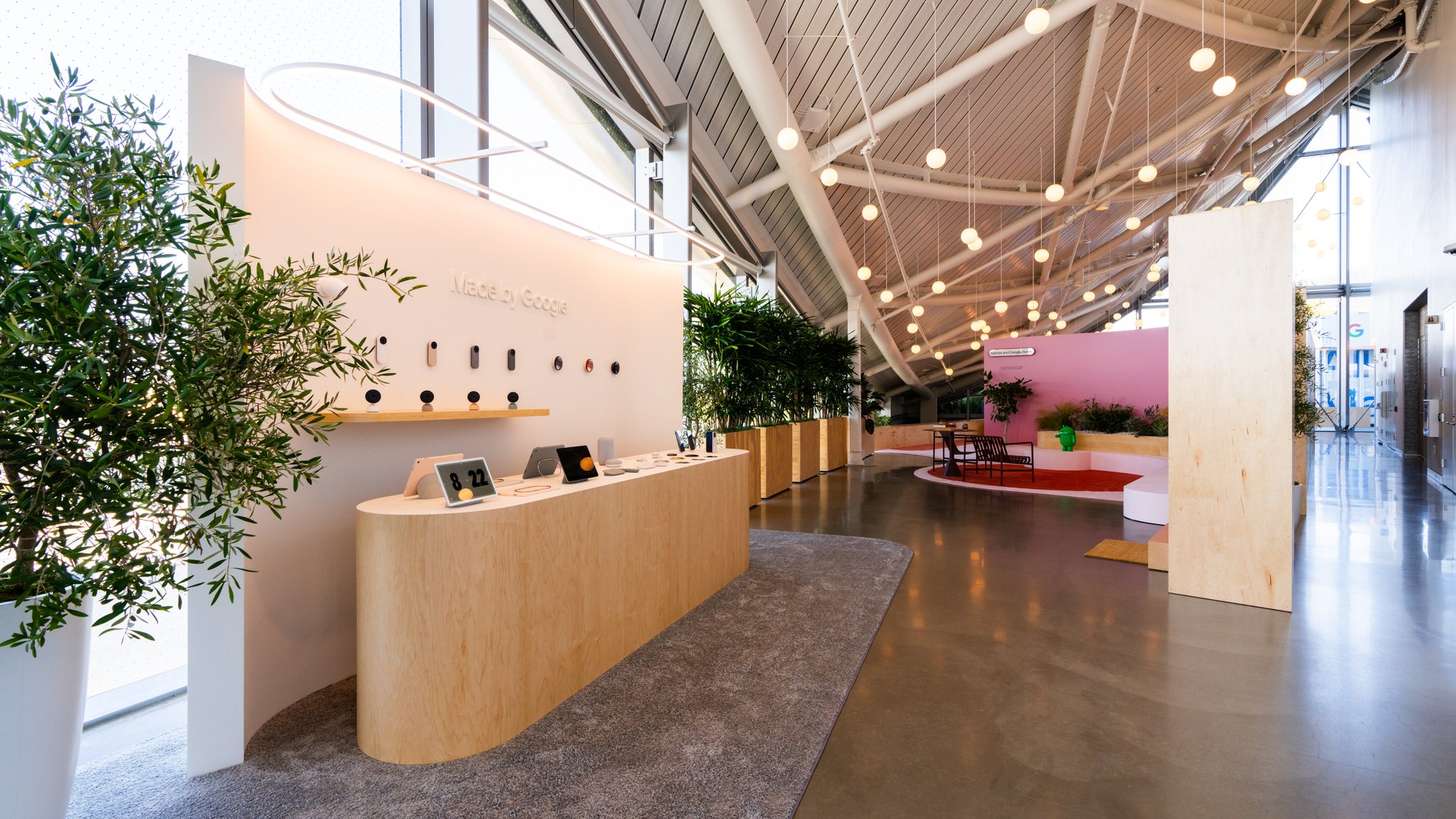
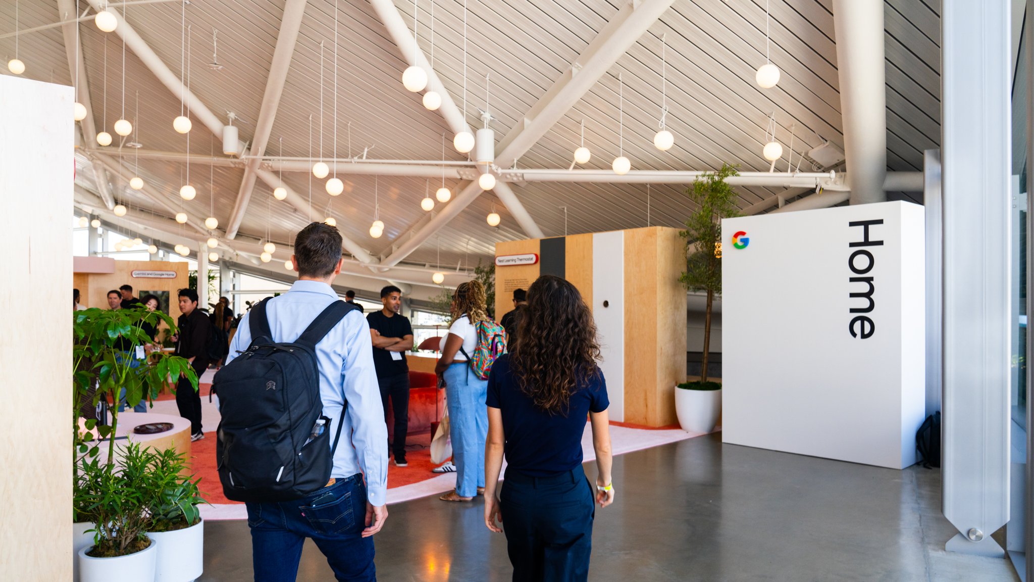
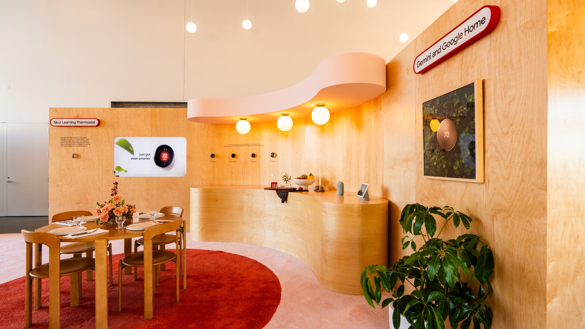
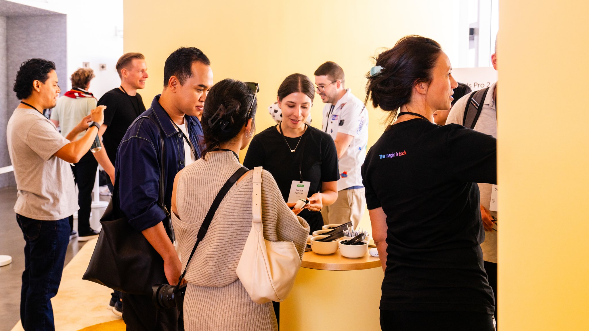
On the day, the space did what a well-designed space does: it disappeared. What remained were the conversations — press moving between zones, spending time with product teams, engaging with features on their own terms. Not a presentation they sat through. An experience they moved through.
That's the difference between a room that informs and a space that connects. We know how to build the second one.
That's the difference between a room that informs and a space that connects. We know how to build the second one.